FEA110 Enhance color contrast for color blindness
| Feature ID | FEA110 |
| Subsystem the feature is part of | User interface and accessibility |
| Responsible person | Topias Häkli |
| Status | processing |
Description
Enhance color contrast for color blindness
Restrictions, requirements and use cases related to this feature
Restrictions:
Developers need to balance contrast improvements with maintaining the overall aesthetic and usability of the interface.
| Requirements | Definitions |
|---|---|
| Aesthetic Considerations | Maintaining a visually appealing design |
| Consistency | Maintaining consistency across the interface is important |
| Technical Constraints | Technical constraints in implementing certain color contrast enhancements |
Preliminary user stories
- US046: As a user with color blindness, I want the web app to have sufficient color contrast between text and background elements, so that, I can easily read and understand the content.#46
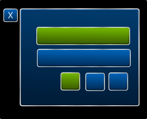
User interface mock-up
Add a picture or a link here. The mock-up should be essentially related to the feature/functionality.
Testing / possible acceptance criteria
Write down some notions for testing
| Testcase | Test source | Responsible |
|---|---|---|
| Testcase 1 | Requirement ID? | |
| Testcase 2 | Requirement ID? | |
| Testcase 3 | Requirement ID? | |
| Testcase 4 | Requirement ID? | |